A/B test examples from real ecommerce brands. Before, tested, and kept or not.
Real experiments from brands such as Timberland, Bottega Veneta and Reebok, grouped by page type. Each shows the page before, the version tested, what changed and ABSee’s reading of the hypothesis.22 real experiments across 4 page types
Updated October 2026 · Source: ABSee record · Methodology →
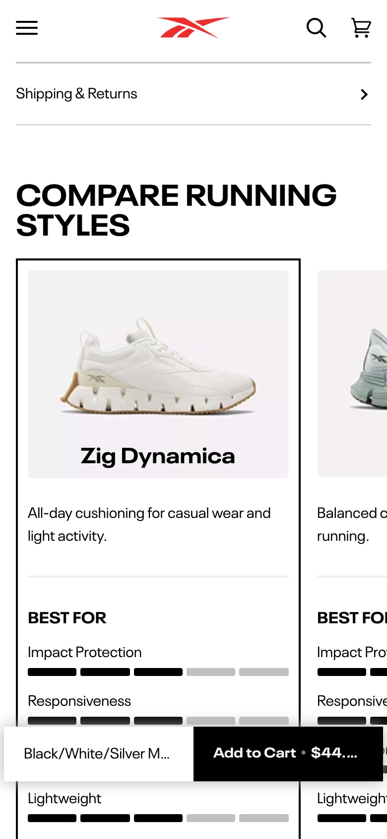
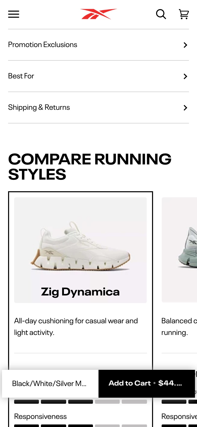
Removes the 'Best For' accordion from the product details list
Likely hypothesis
By removing the 'Best For' accordion from the product page, we can lift add-to-cart rate, because a shorter details list gets shoppers to the buying decision with fewer low-value sections to scan.
Seen 7 Aug to 4 Oct 2026
Problem being solved and strategic takeaway
Problem being solved
A rarely useful details section adds length and noise below the buy box
Strategic takeaway
Removing a low-engagement content section and measuring the result is a cheap way to find which product-page elements actually earn their place. The brand kept this after testing.
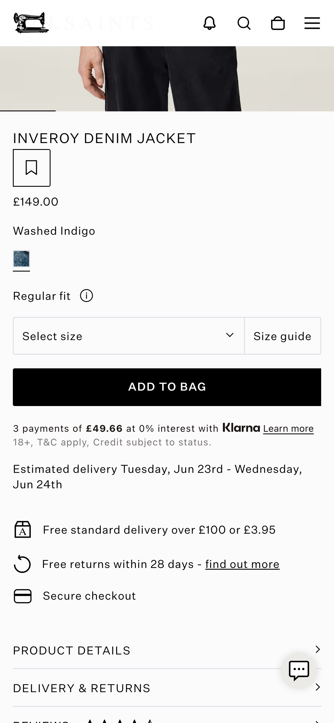
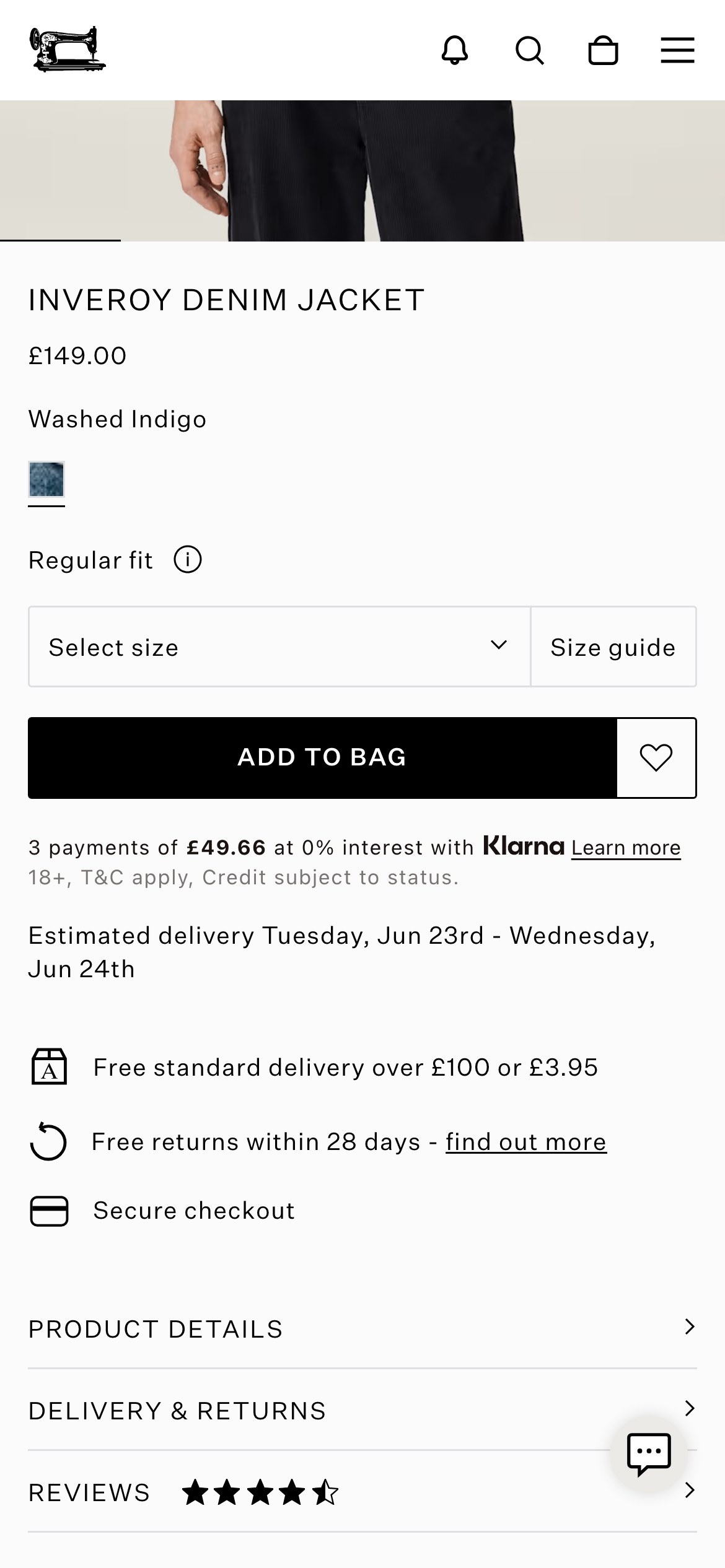
Relocates the wishlist button and updates its icon to a bookmark.
Likely hypothesis
By relocating the wishlist button next to the product title and testing a bookmark icon, we can increase the wishlist addition rate, because placing the action in the shopper's primary reading path improves its discoverability.
Seen 19 Jun to 17 Jul 2026
Problem being solved and strategic takeaway
Problem being solved
Standard wishlist button placement and default icons are often easily overlooked by shoppers.
Strategic takeaway
Positioning secondary actions like save options directly alongside primary focal points like product titles improves interaction consistency.
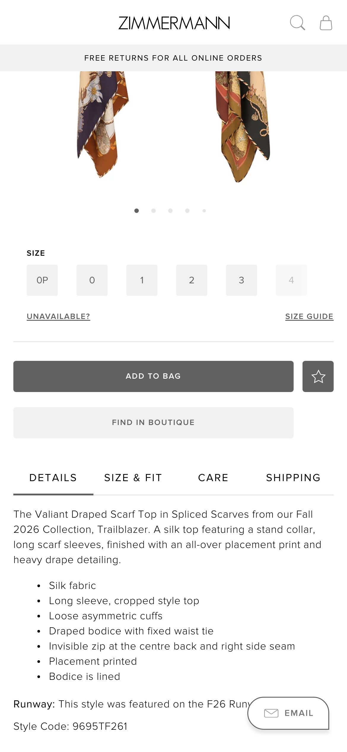
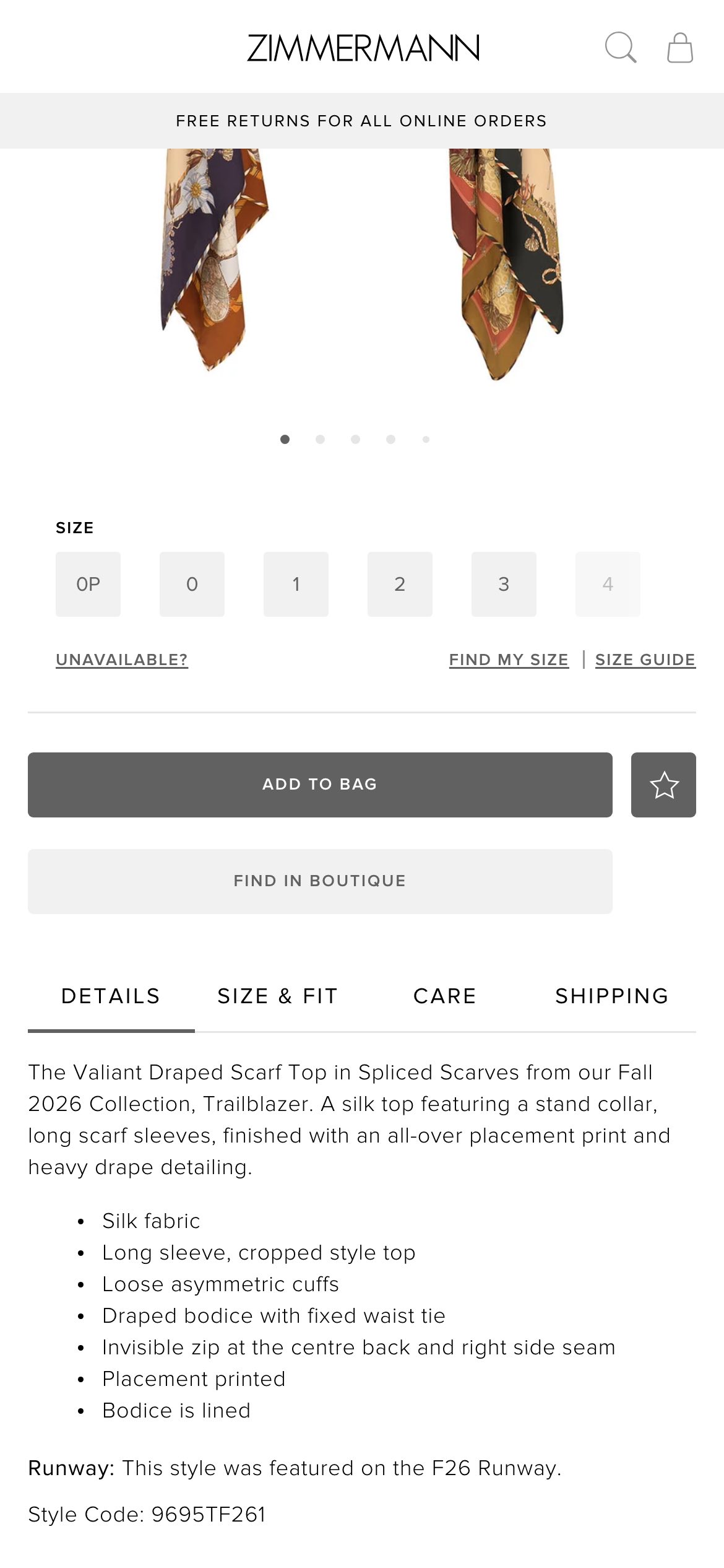
Hides the automated size recommendation and measurement button.
Likely hypothesis
By removing the automated sizing tool, we can increase add-to-cart conversion, because shoppers avoid the cognitive load of a secondary decision-making widget and proceed directly to purchasing.
Seen 21 Jul to 5 Aug 2026
Problem being solved and strategic takeaway
Problem being solved
Secondary sizing tools can add friction and distract users from selecting a size to buy.
Strategic takeaway
Removing secondary decision-making widgets can decrease cognitive load and streamline the main conversion funnel.
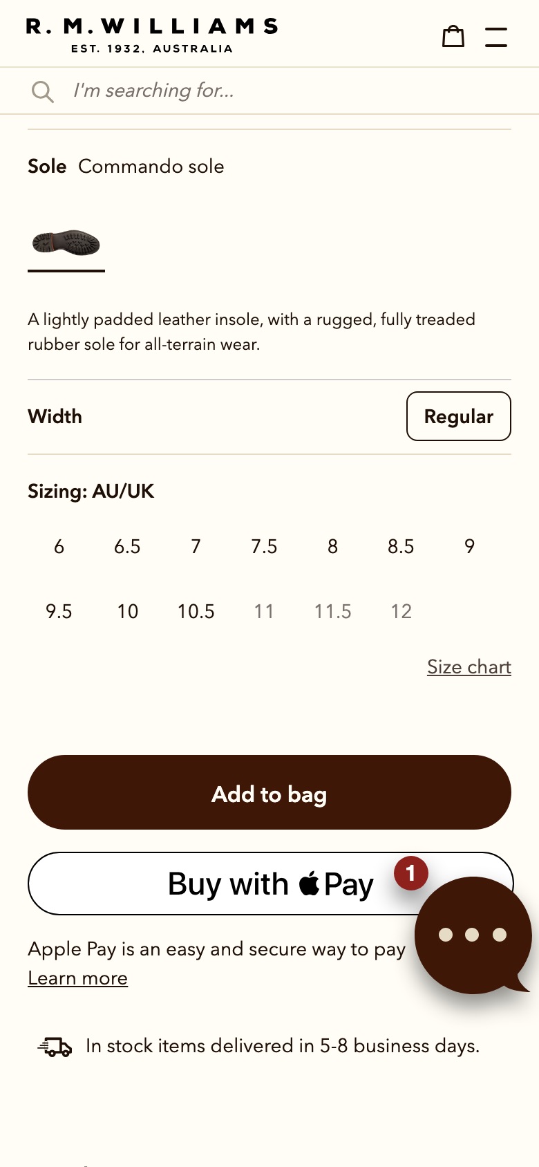
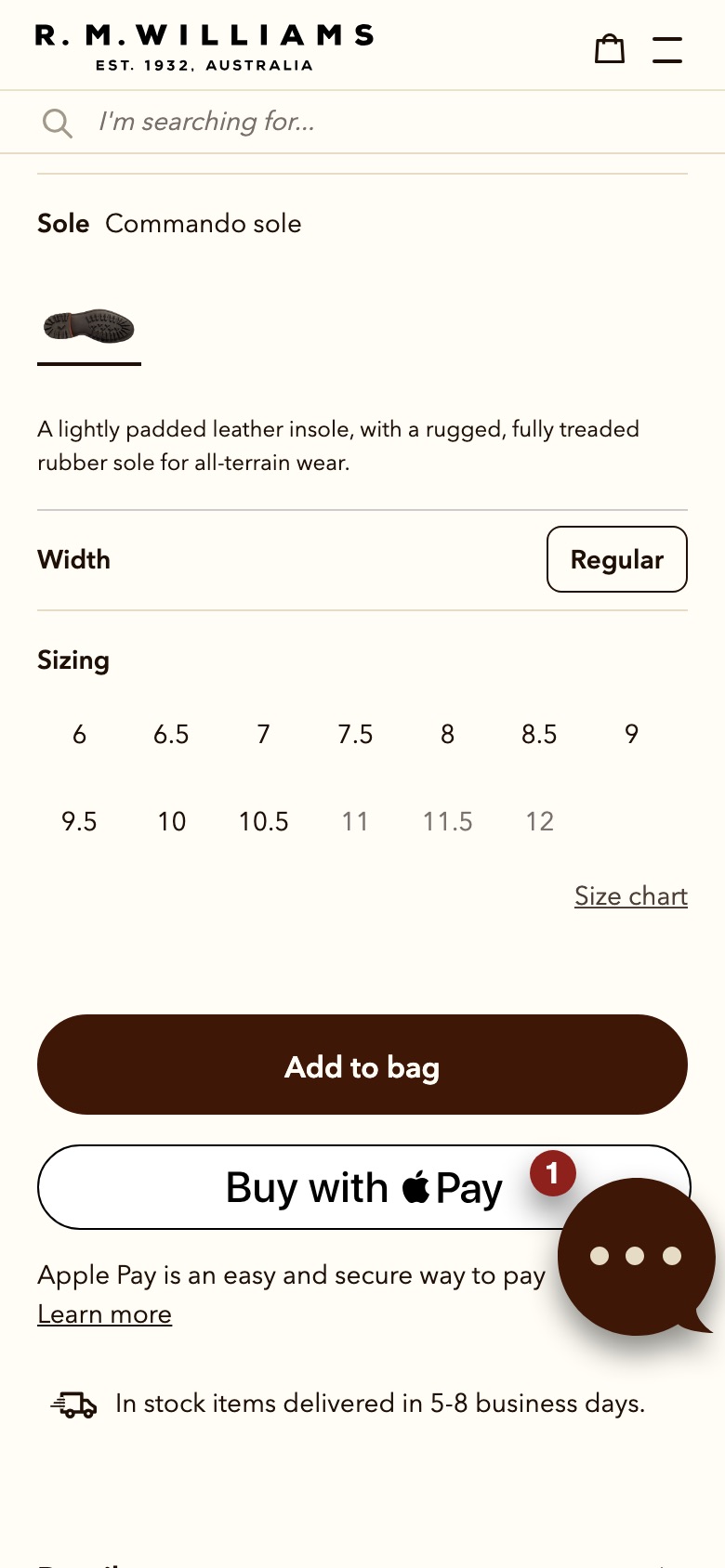
Renames the "Sizing" label above the product page size options
Likely hypothesis
By rewording the size-selector label on the product page, we can lift the rate of shoppers who select a size and add to cart, because clearer labelling helps shoppers recognise the size choice as a required step rather than optional detail.
Seen 14 Aug to 1 Sep 2026
Problem being solved and strategic takeaway
Problem being solved
Shoppers overlook or misread the size step and hesitate before adding to cart
Strategic takeaway
Renaming a form label to match the shopper's own vocabulary can reduce hesitation at a required selection step, because ambiguous headings increase cognitive load at the decision point.
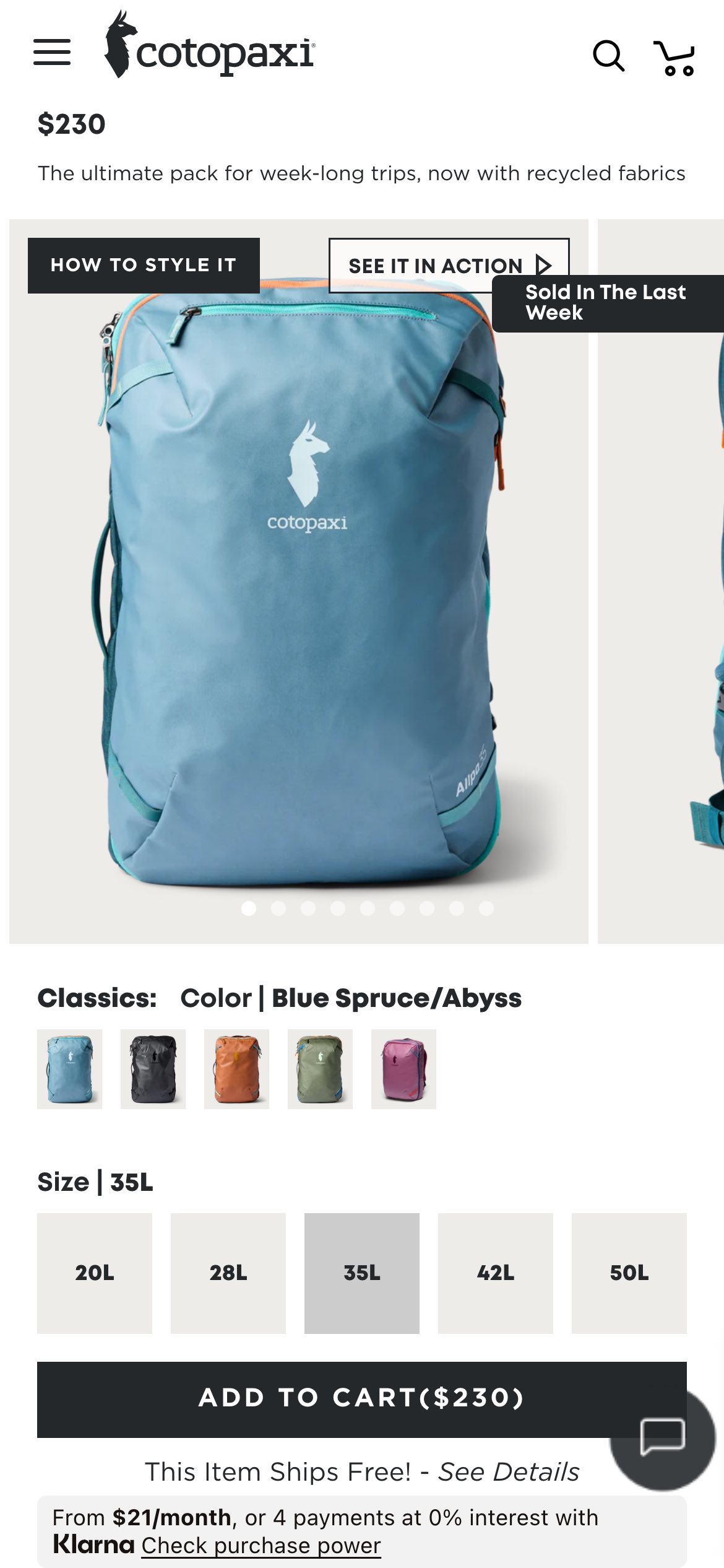
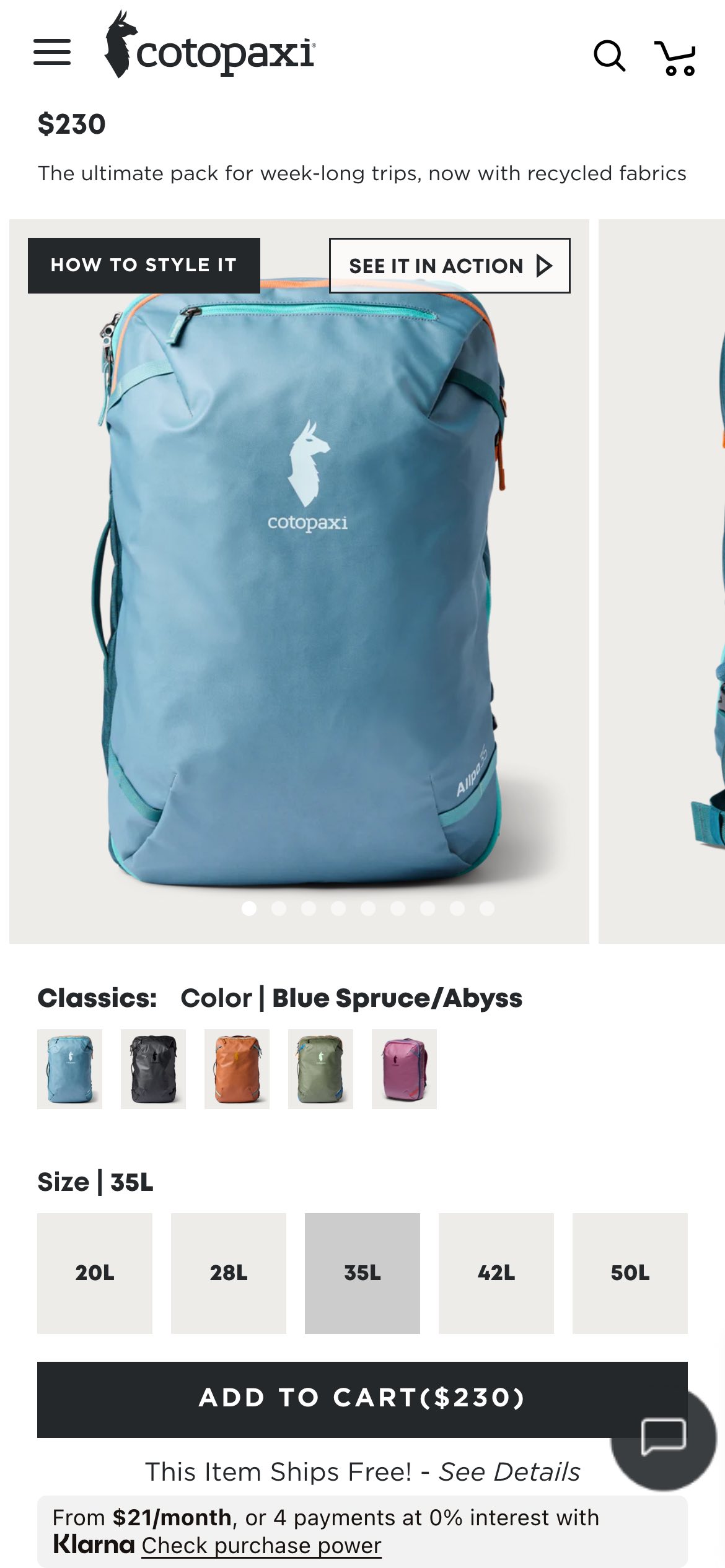
Adds a small popup with a recent-purchase count near the product photos.
Likely hypothesis
By showing a recent-purchase count near the product photos, we can lift add-to-cart rate, because shoppers gain reassurance from seeing that others recently bought the same item.
Seen 4 Jul to 24 Jul 2026
Problem being solved and strategic takeaway
Problem being solved
Removes doubt about whether a product is popular enough to trust.
Strategic takeaway
Displaying a recent-purchase count near the product image can reduce a shopper's uncertainty and nudge them toward action.
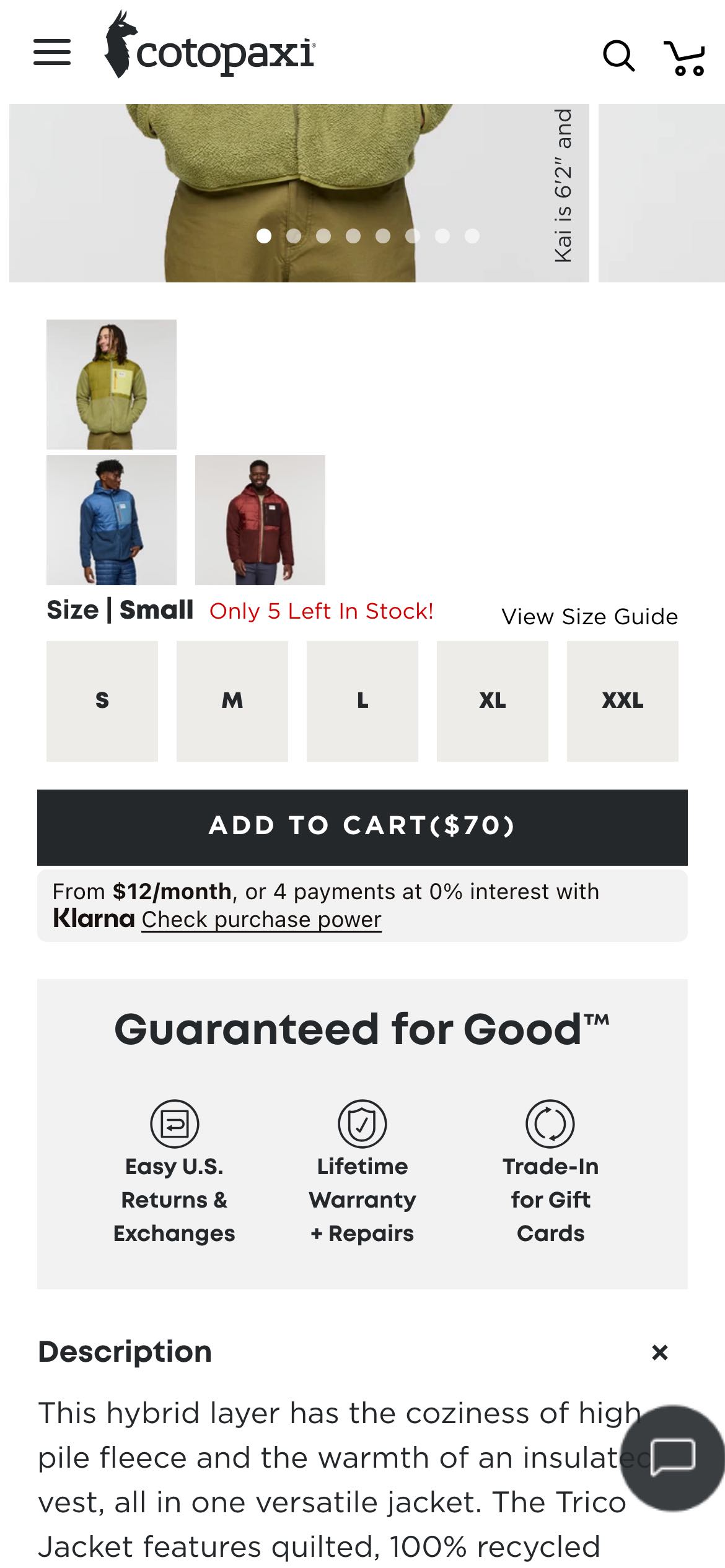
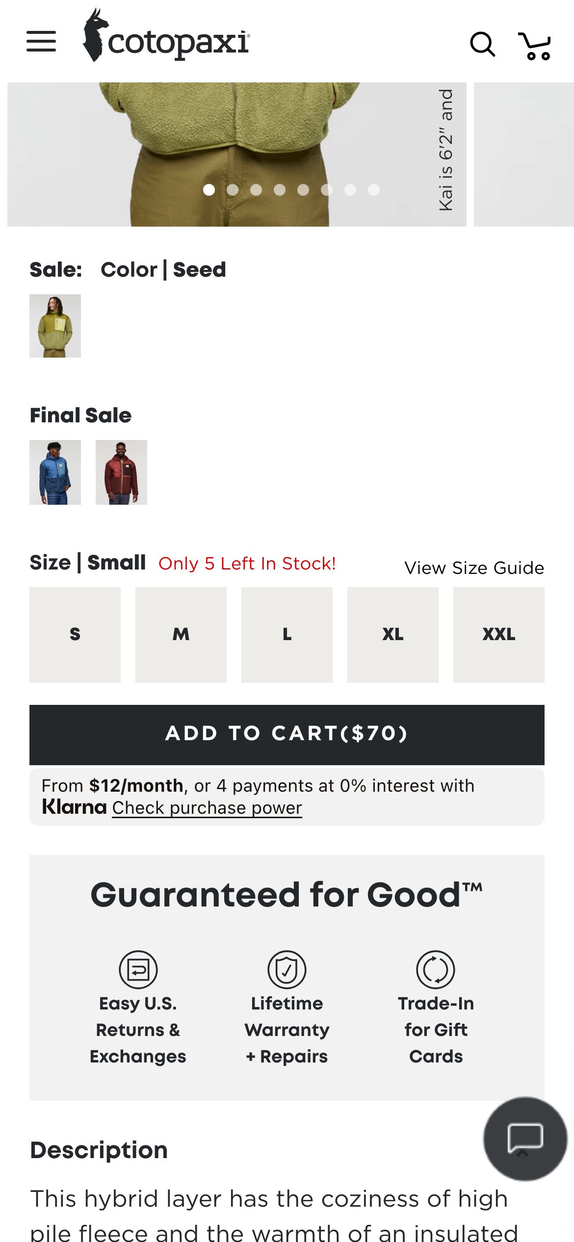
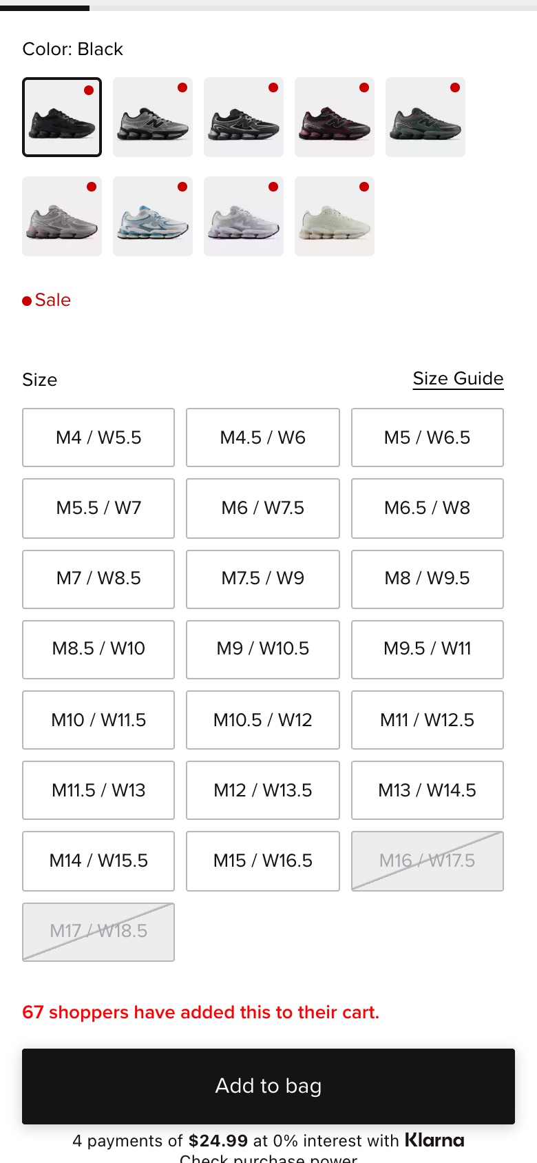
Replaces colour swatches with product photos and a label.
Likely hypothesis
By replacing colour swatches with product photos and a live label, we can lift colour-selection confidence, because seeing the actual product in each colour makes the choice clearer.
Seen 4 Jul to 31 Jul 2026
Problem being solved and strategic takeaway
Problem being solved
Plain swatches don't show how each colour really looks.
Strategic takeaway
Showing real product imagery per option can reduce uncertainty in variant selection.
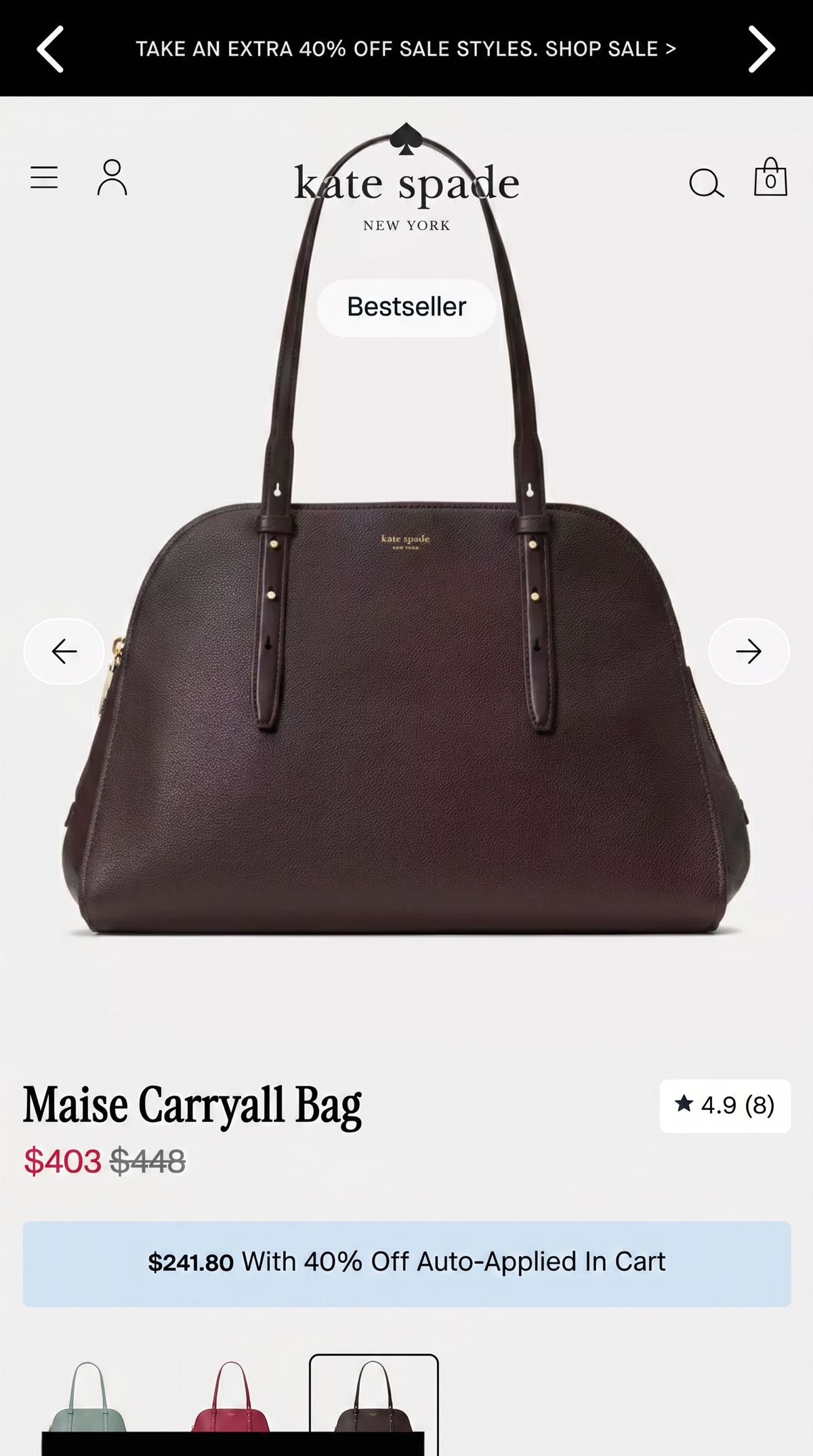
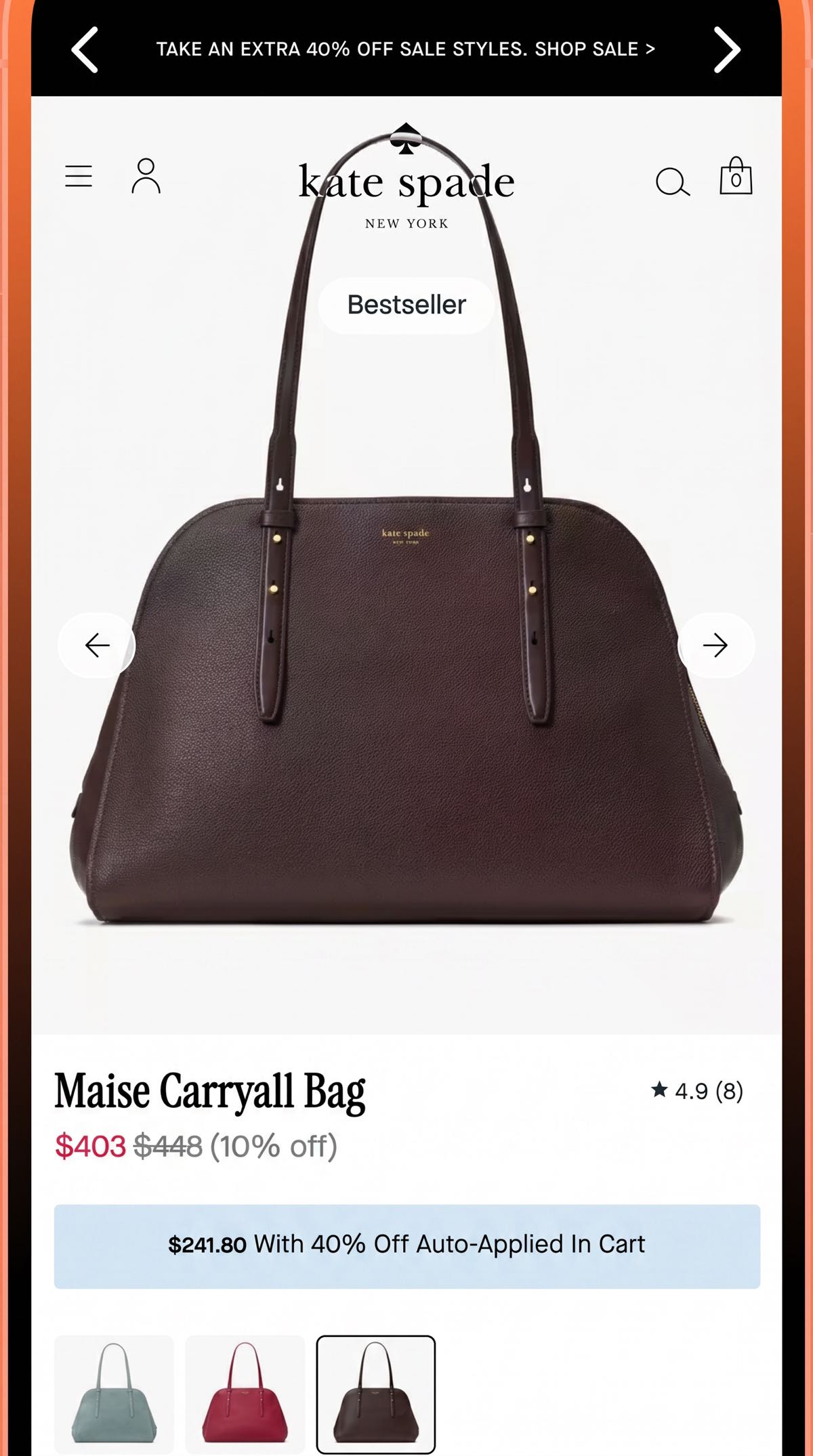
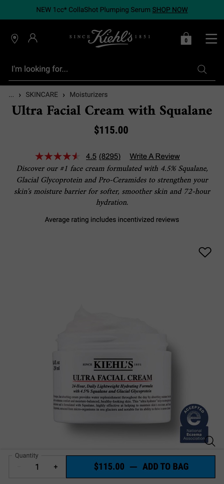
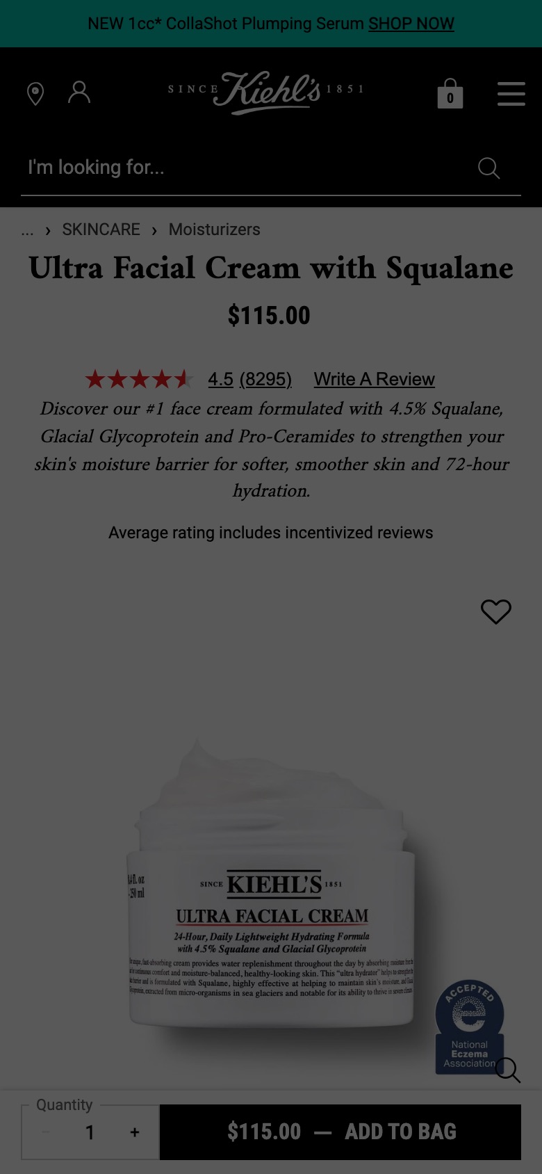
Hides the discount percentage label from the price display.
Likely hypothesis
By hiding the discount percentage, we can improve conversion on sale items, because shoppers focus directly on the lower absolute price rather than scrutinising potentially unimpressive percentage figures.
Seen 19 May to 17 Jul 2026
Problem being solved and strategic takeaway
Problem being solved
Displaying small or unimpressive discount percentages can unintentionally devalue a compelling absolute sale price.
Strategic takeaway
Removing the relative percentage discount can lift perceived value when the absolute price point is strong enough to stand alone.
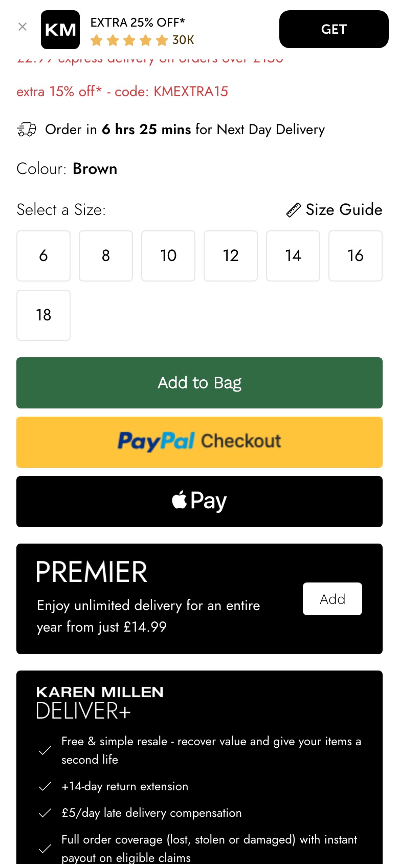
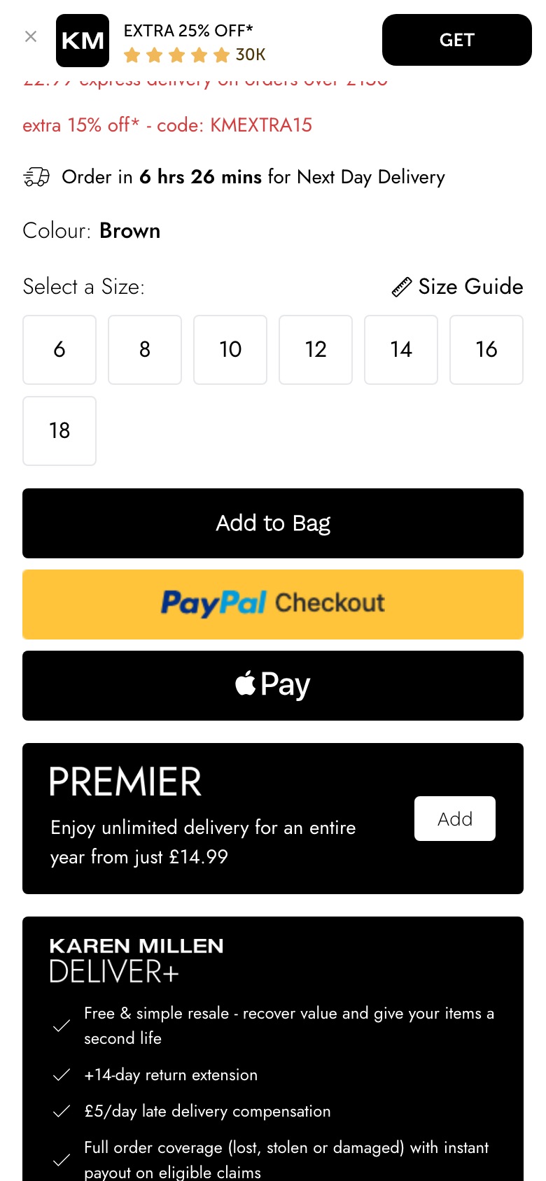
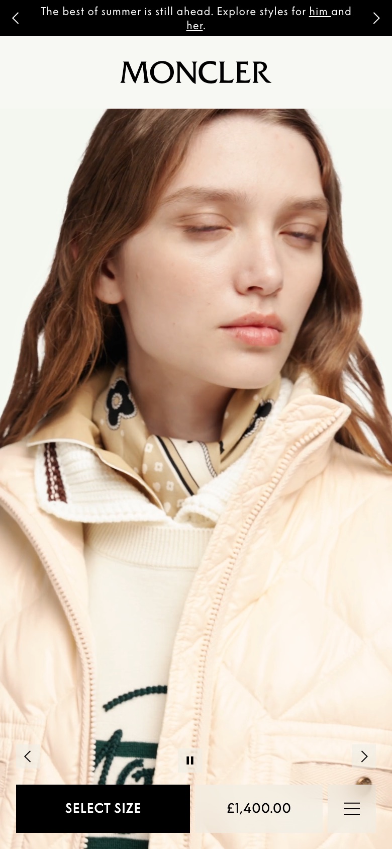
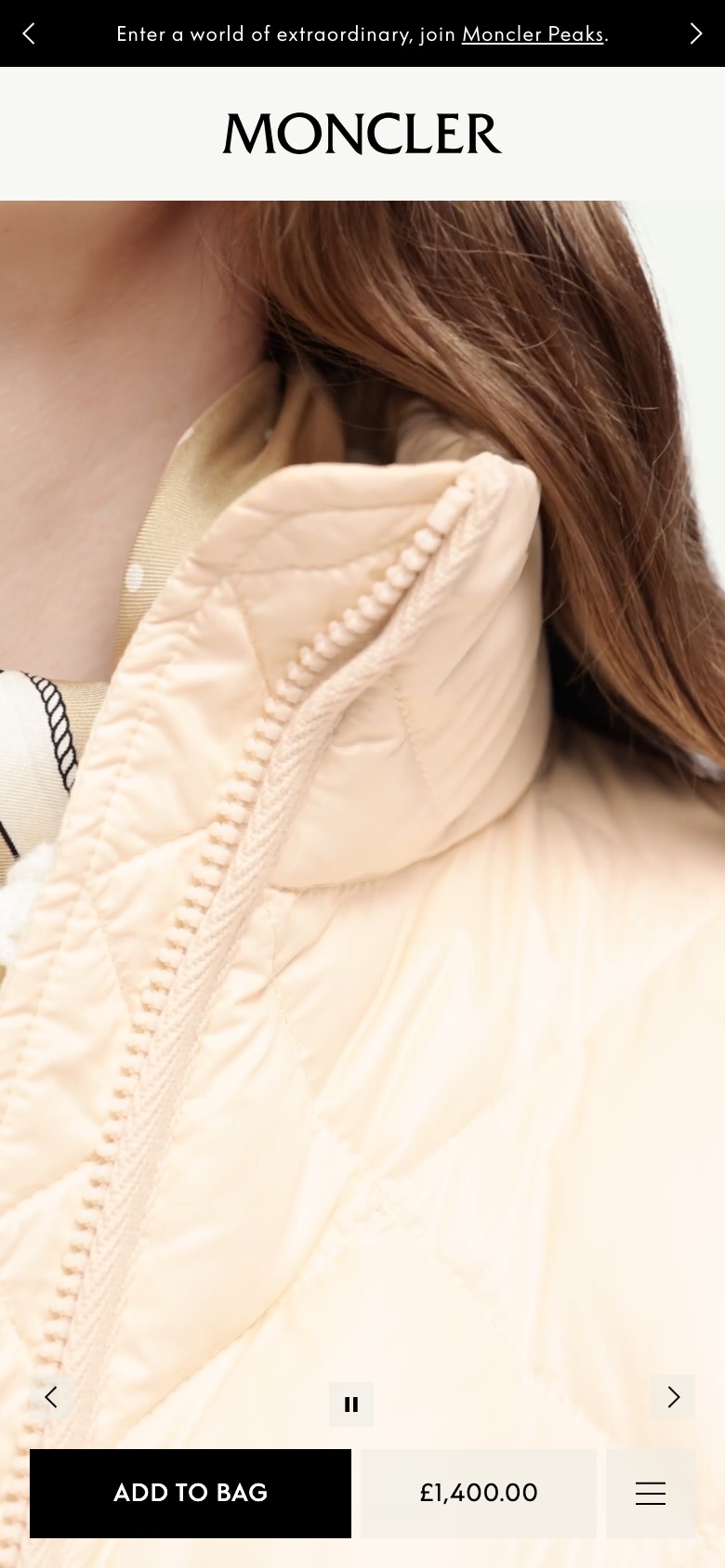
Relabels the purchase button to prompt size selection first
Likely hypothesis
By relabelling the product page purchase button to prompt size selection, we can lift the rate of completed add-to-bag actions, because shoppers are told the next required step up front instead of hitting an error after tapping the button.
Seen 3 Aug to 18 Sep 2026
Problem being solved and strategic takeaway
Problem being solved
Shoppers tap to buy, then hit an unexpected 'choose a size' interruption
Strategic takeaway
Naming the next required step on a primary button, rather than the end goal, can reduce failed taps and friction in multi-step purchase flows.
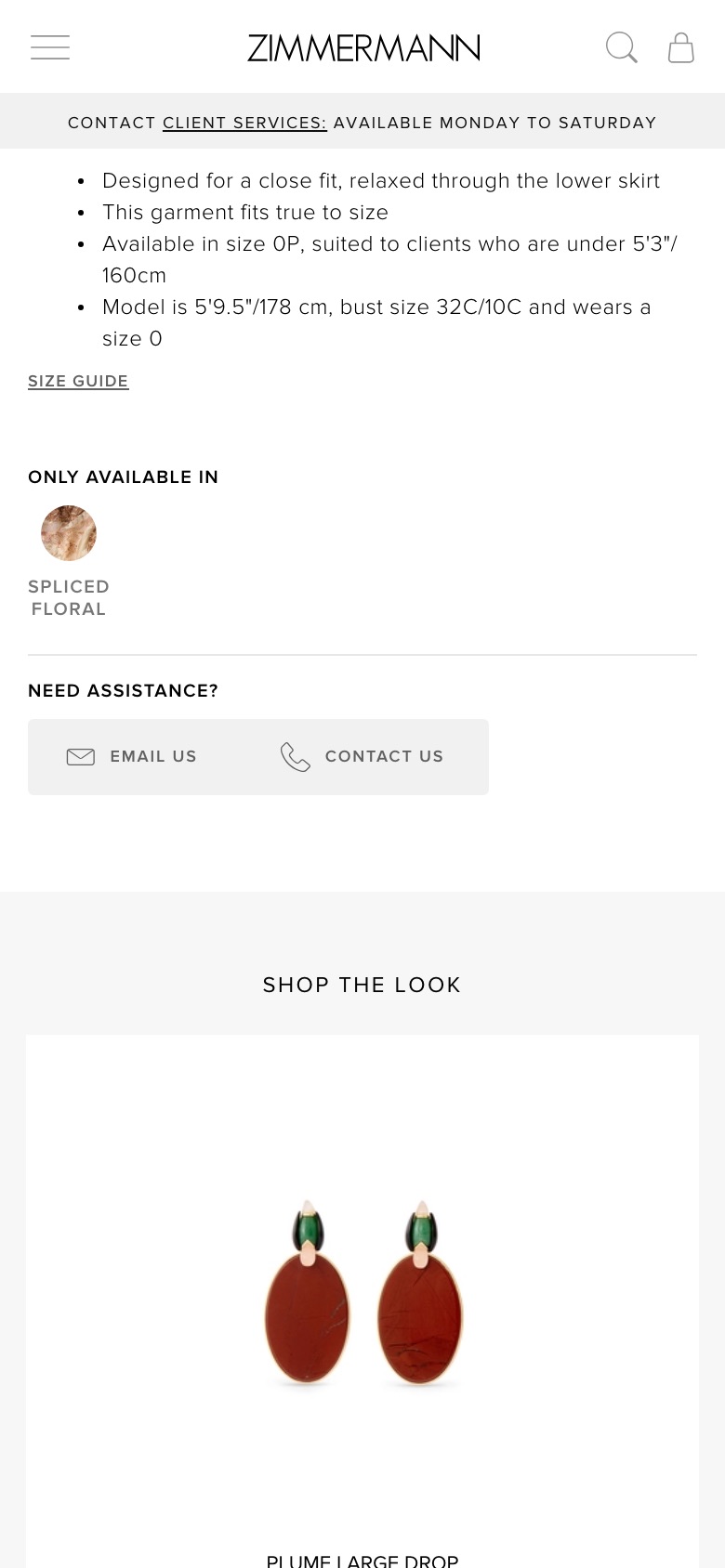
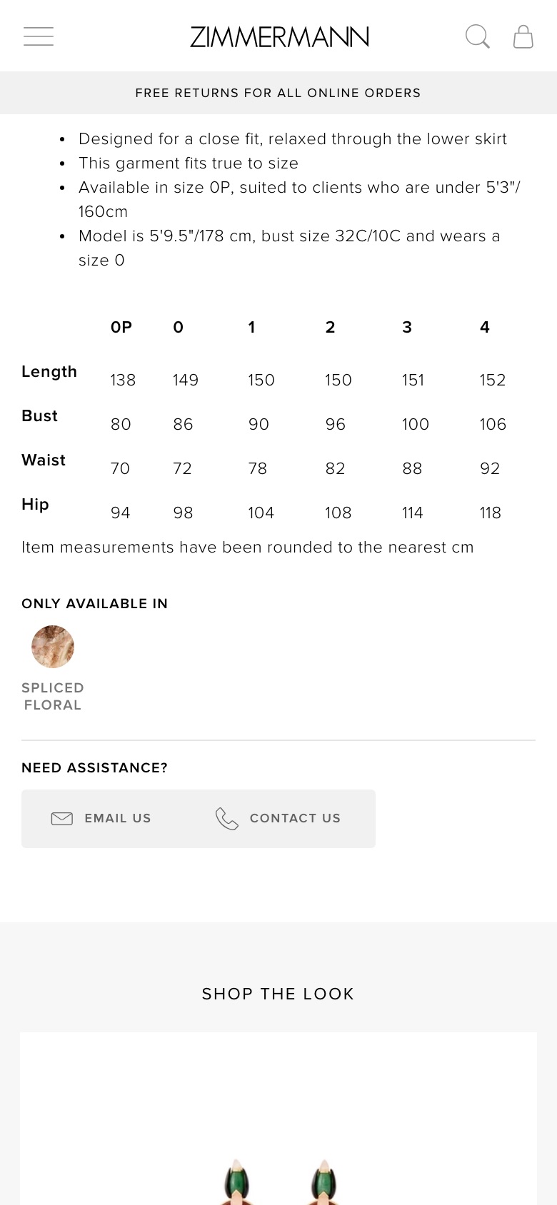
Adds a size guide link directly to the product details section.
Likely hypothesis
By adding a dedicated size guide link within the product fit section, we can increase the add-to-cart rate, because shoppers can quickly resolve sizing uncertainties without having to hunt for the information elsewhere.
Seen 14 Jul to 1 Sep 2026
Problem being solved and strategic takeaway
Problem being solved
Shoppers often hesitate to purchase when sizing information is hard to locate.
Strategic takeaway
Placing crucial decision-making tools exactly where shoppers evaluate product fit reduces purchase anxiety and prevents them from abandoning their current task to search for information.
Pins the add-to-cart area to the bottom of the screen while scrolling
Likely hypothesis
By pinning the product page's add-to-cart area to the bottom of the screen as shoppers scroll, we can lift product-page-to-basket conversion, because the buy action stays one tap away instead of requiring a scroll back up once the shopper has read enough to decide.
Seen 31 Jul to 7 Aug 2026
Problem being solved and strategic takeaway
Problem being solved
Shoppers who decide deep down the page must scroll back up to buy
Strategic takeaway
Keeping the main call to action in view as content scrolls reduces the friction between intent and action, and may capture decisions made late in the page.
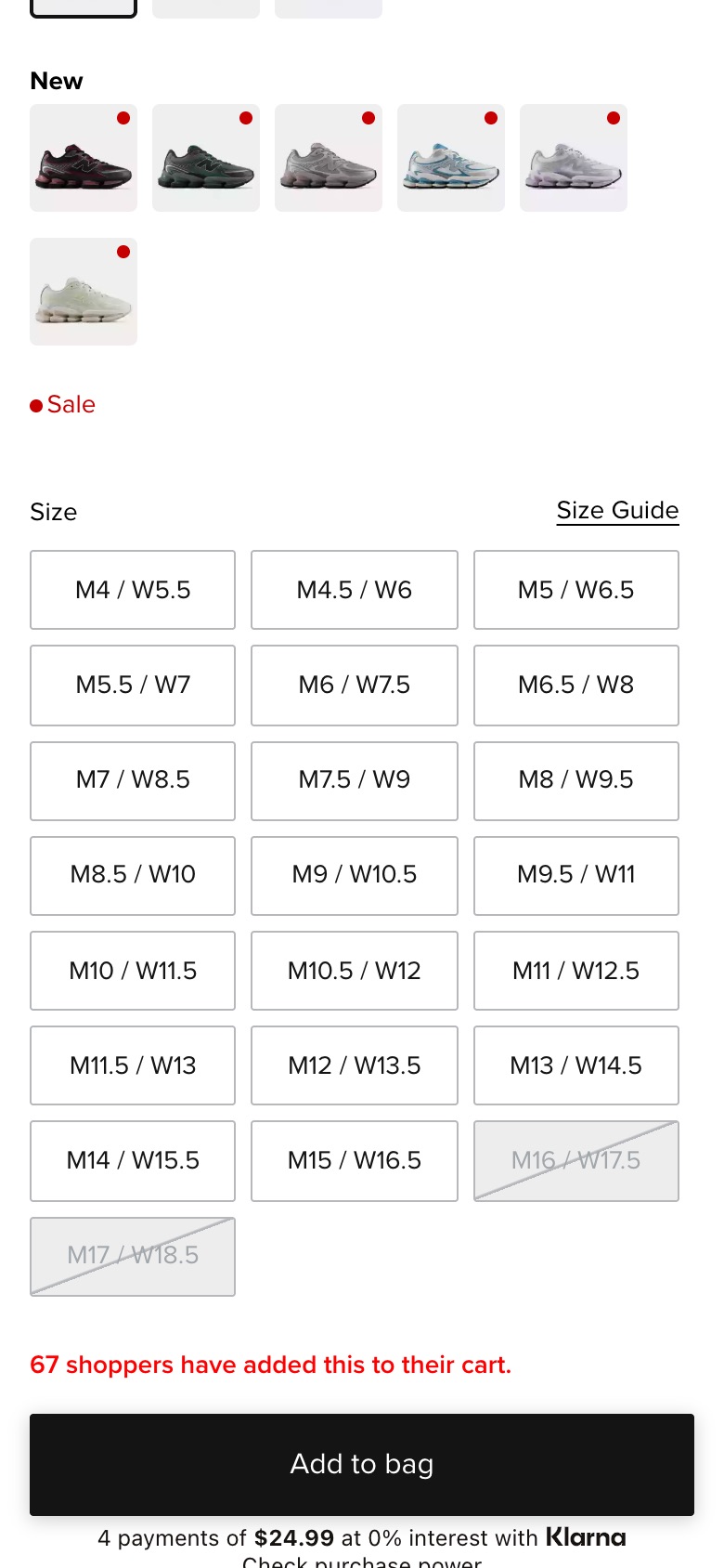
Groups newly added item colors into a separate dedicated row section.
Likely hypothesis
By separating new color options into their own distinct row, we can increase add-to-cart rates, because it highlights fresh inventory and helps shoppers quickly identify new styles without hunting through a long list.
Seen 2 Jun to 16 Jul 2026
Problem being solved and strategic takeaway
Problem being solved
Shoppers struggling to find fresh color updates among long lists of standard colors.
Strategic takeaway
Separating distinct item attributes (like new additions) into visual subgroups reduces browsing friction and highlights fresh inventory.
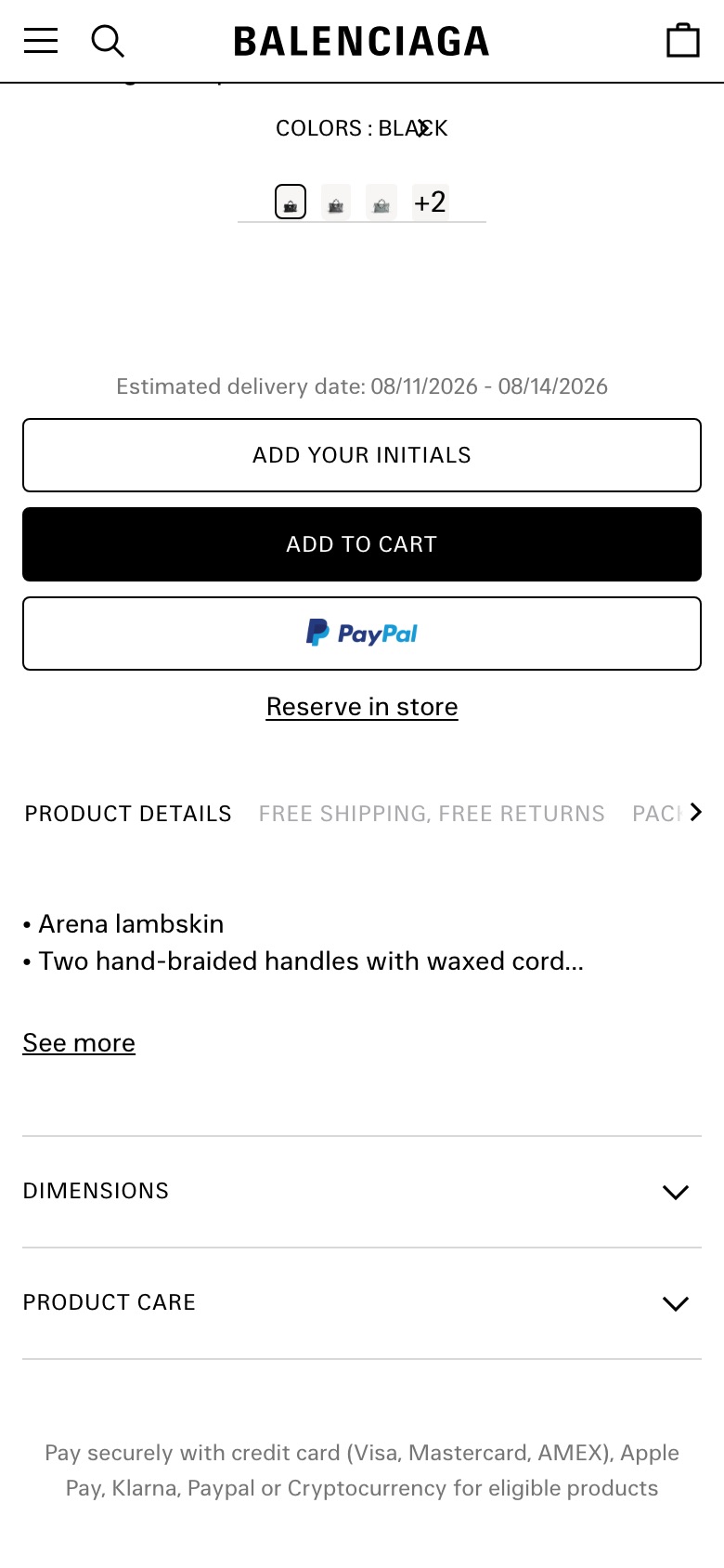
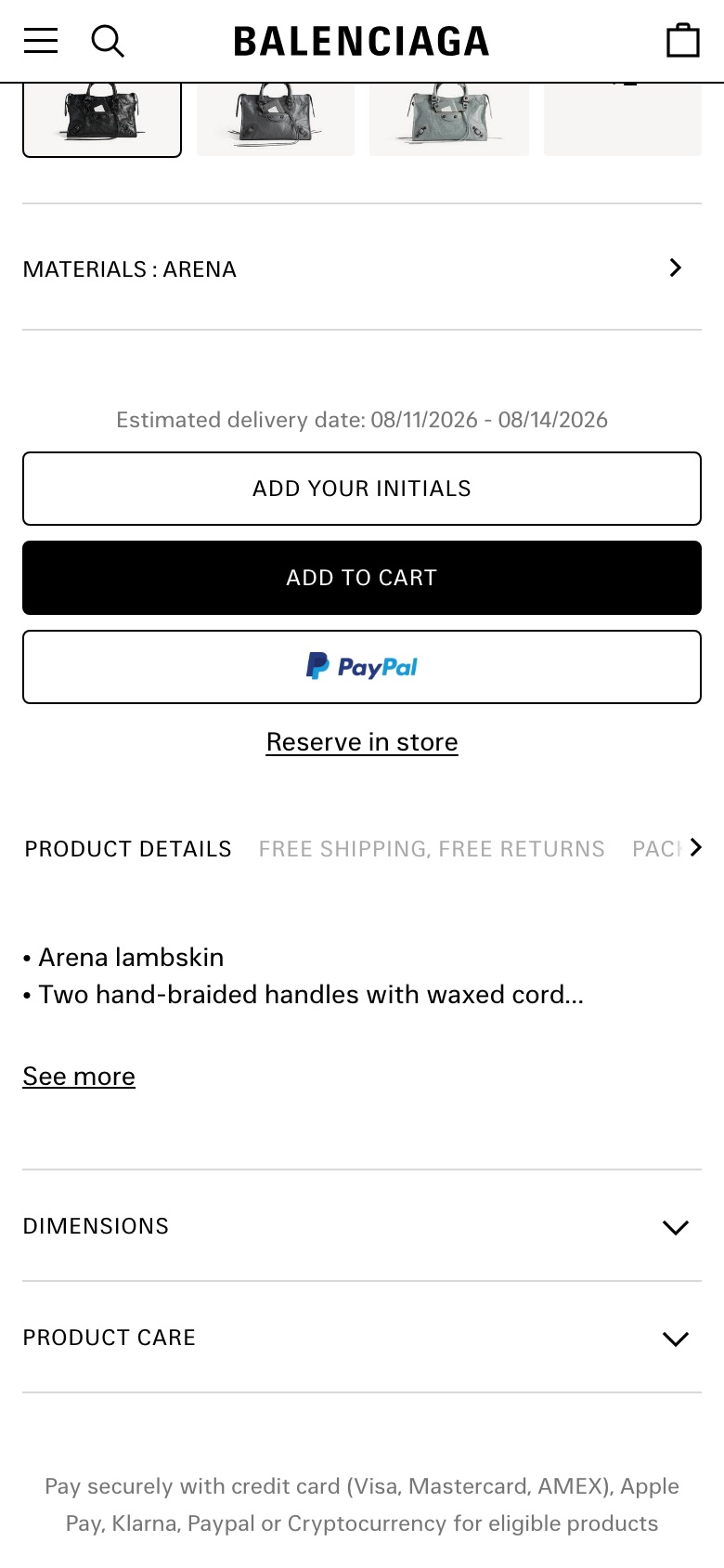
Merges material options into the product page's colour swatch row
Likely hypothesis
By merging the separate other-materials carousel into one swipeable swatch row on the product page, we can lift product-page-to-add-to-cart rate, because shoppers see the full range of variants in one place and stop missing options that were previously buried in a second module.
Seen 3 Aug to 17 Sep 2026
Problem being solved and strategic takeaway
Problem being solved
Shoppers miss alternative versions of a product split across two separate modules
Strategic takeaway
Presenting all variants of an item in a single row rather than scattered modules reduces cognitive load and may prevent shoppers abandoning before finding the version they want.
Principle
Choice Consolidation
Category page
What shoppers see first when they browse a range: the header above the grid and the photo on each listing tile.
Hides the top promotional slot and introduces a responsive hero banner.
Likely hypothesis
By hiding the top promotional slot and updating the category hero layout, we can increase product click-through rates, because shoppers face less visual distraction above the fold and can begin browsing the inventory more easily.
Seen 8 Jun to 21 Jun 2026
Problem being solved and strategic takeaway
Problem being solved
Intrusive promotional slots and misaligned header text distract users from the core browsing experience.
Strategic takeaway
Simplifying top-of-page layouts by removing secondary promotional slots can help visitors focus immediately on the main content.
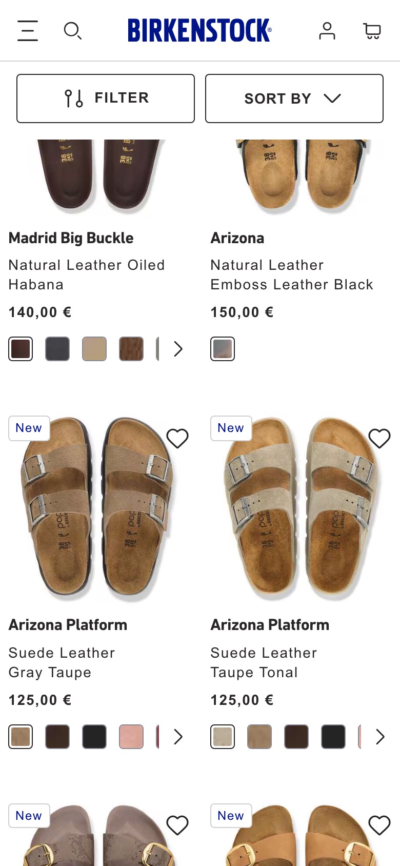
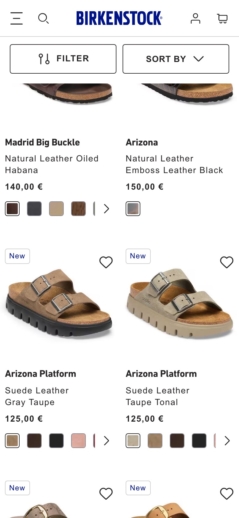
Swaps each product tile's main photo to a top-down view
Likely hypothesis
By showing a top-view product photo as the main image on category tiles, we can lift click-through from category page to product page, because an overhead angle reveals footbed shape and strap layout that shoppers use to judge fit at a glance.
Seen 15 Sep to 21 Sep 2026
Problem being solved and strategic takeaway
Problem being solved
Shoppers can't judge shape and strap detail from the default angle
Strategic takeaway
Leading a product grid with the angle that answers the shopper's main question can reduce evaluation effort and speed browsing decisions.
Principle
Angle Selection
Homepage
The first page many shoppers open: navigation shortcuts and the sign-up pop-up.
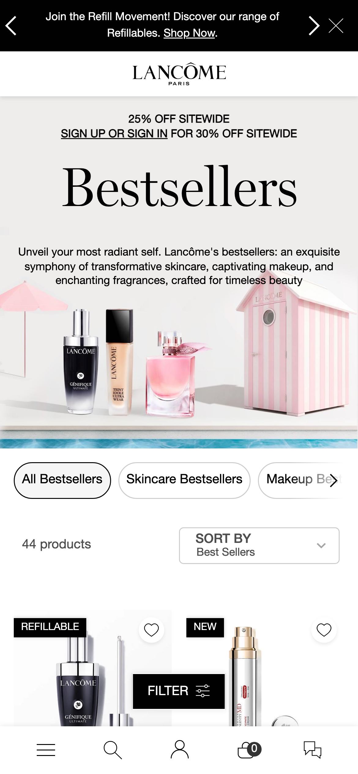
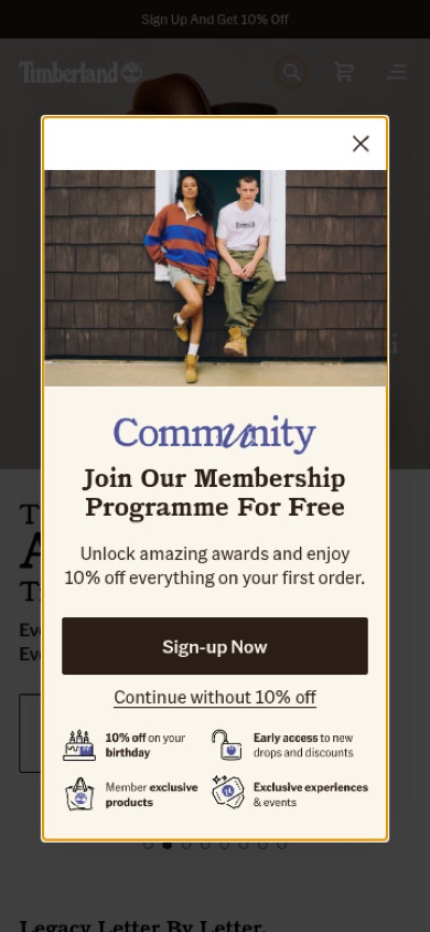
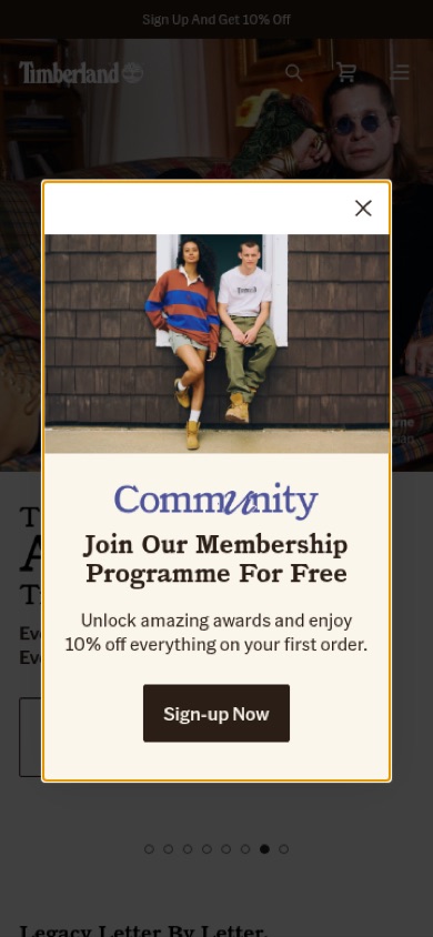
Membership pop-up adds a benefits list and opt-out link
Seen 6 Aug to 4 Oct 2026
Problem being solved and strategic takeaway
Problem being solved
A pop-up that only offers a one-off discount gives visitors little reason to join the programme
Strategic takeaway
Backing a sign-up discount with a short list of ongoing member benefits can make joining feel worth more than the one-off offer, and naming what the visitor gives up by declining makes the choice explicit.
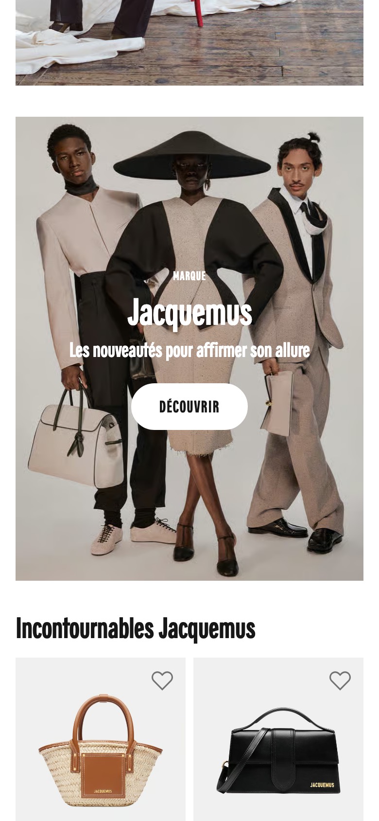
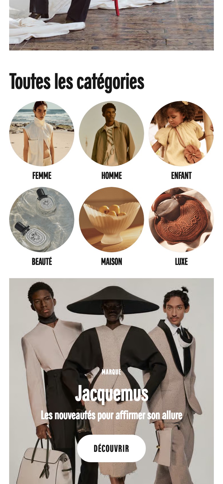
The homepage no longer shows the 'All categories' block of round shortcut tiles or its heading, so shoppers scroll straight from the hero into the featured brand campaign.
Likely hypothesis
By removing the homepage category shortcut grid, we can lift click-through into the featured brand and merchandising content, because shoppers reach the campaign sooner instead of being diverted into a generic category menu.
Seen 22 Aug to 30 Aug 2026
Problem being solved and strategic takeaway
Problem being solved
A generic category menu sitting between the hero and the featured campaign may divert shoppers away from the merchandising the homepage is built to promote.
Strategic takeaway
Removing a generic navigation block from a landing page can push more attention into the featured campaign below it, though it may cost shoppers who prefer to browse by category.
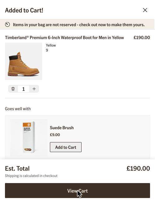
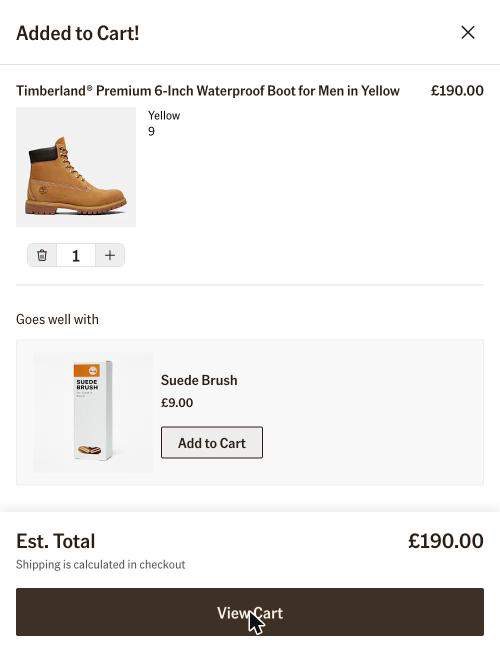
Adds an unreserved inventory warning message to the mini-cart.
Likely hypothesis
By adding a message to the mini-cart warning that items are not reserved, we can increase cart-to-checkout conversion, because shoppers will experience loss aversion and feel an urgent need to secure their selected items.
Seen 19 May to 4 Oct 2026
Problem being solved and strategic takeaway
Problem being solved
Shoppers leaving items in their cart without feeling the urgency to finalize their purchase.
Strategic takeaway
Explicitly stating that carted items are not reserved leverages the fear of missing out, prompting faster checkout decisions.
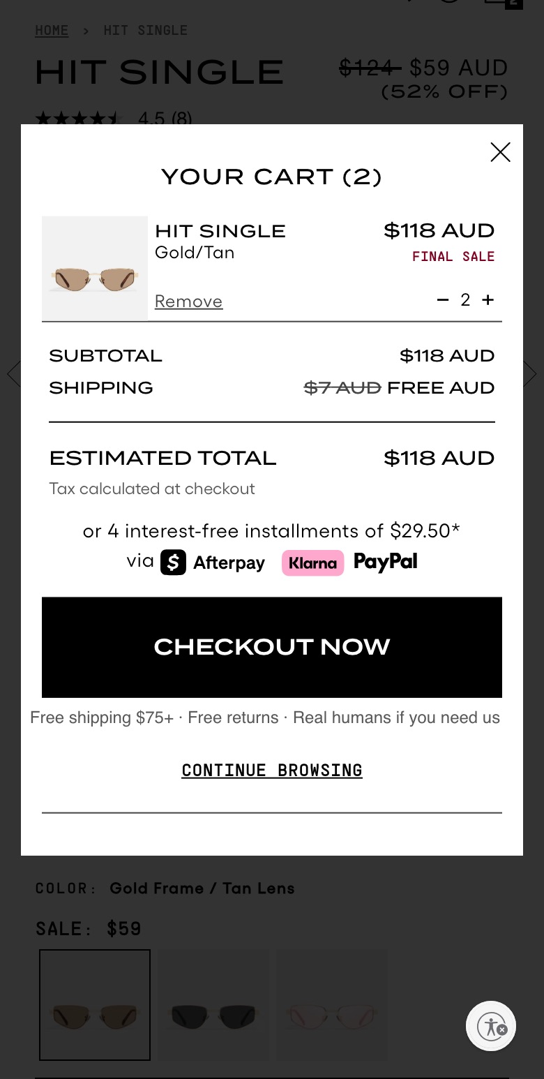
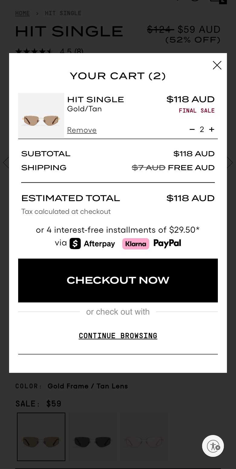
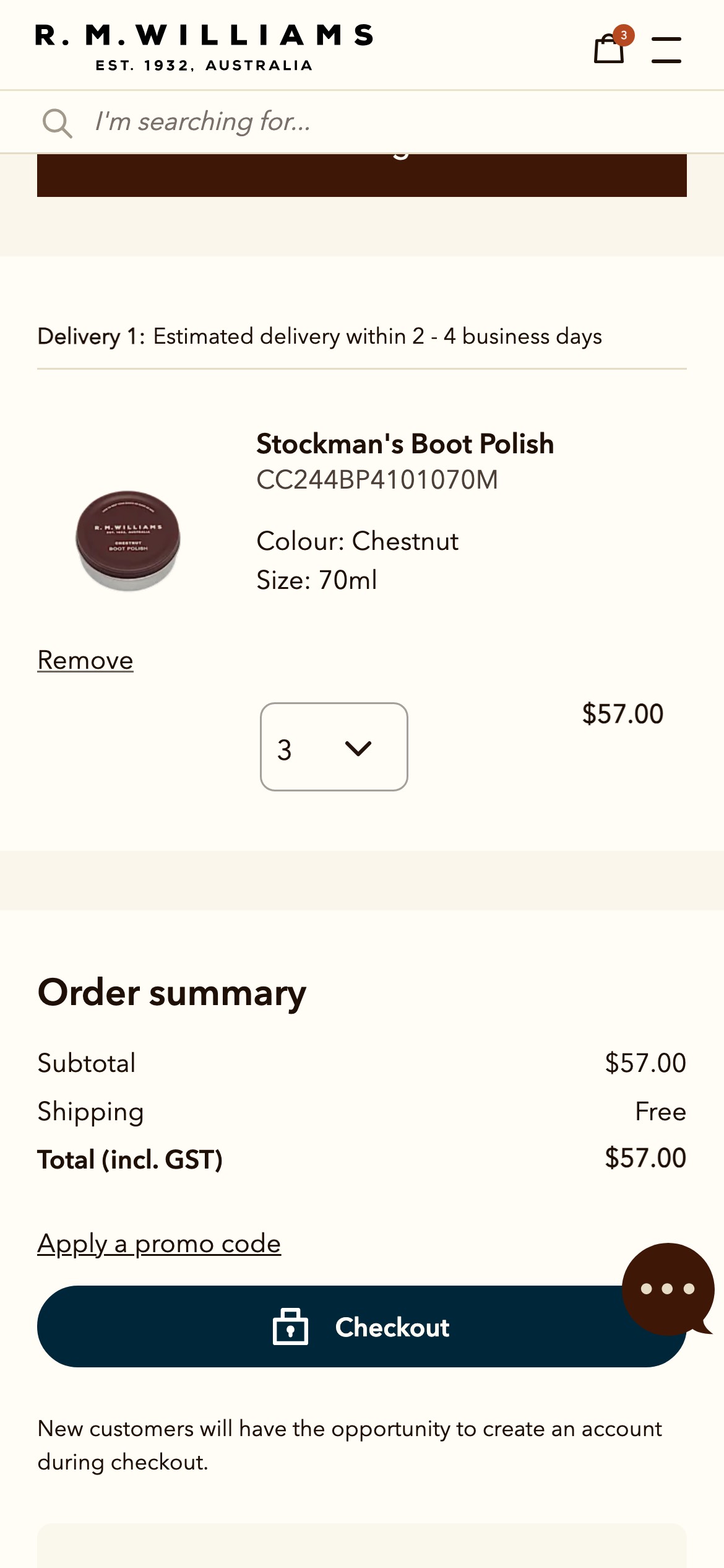
Adds reassurance copy about shipping, returns, and support near the checkout.
Likely hypothesis
By adding shipping, returns, and support reassurance near the checkout button, we can improve cart-to-checkout conversion, because shoppers feel more confident completing their purchase when key anxieties are preemptively addressed.
Seen 24 Jul to 11 Sep 2026
Problem being solved and strategic takeaway
Problem being solved
Shoppers may abandon carts due to uncertainty about shipping costs or returns.
Strategic takeaway
Placing shipping and return reassurances directly next to the checkout button reduces purchase hesitation.
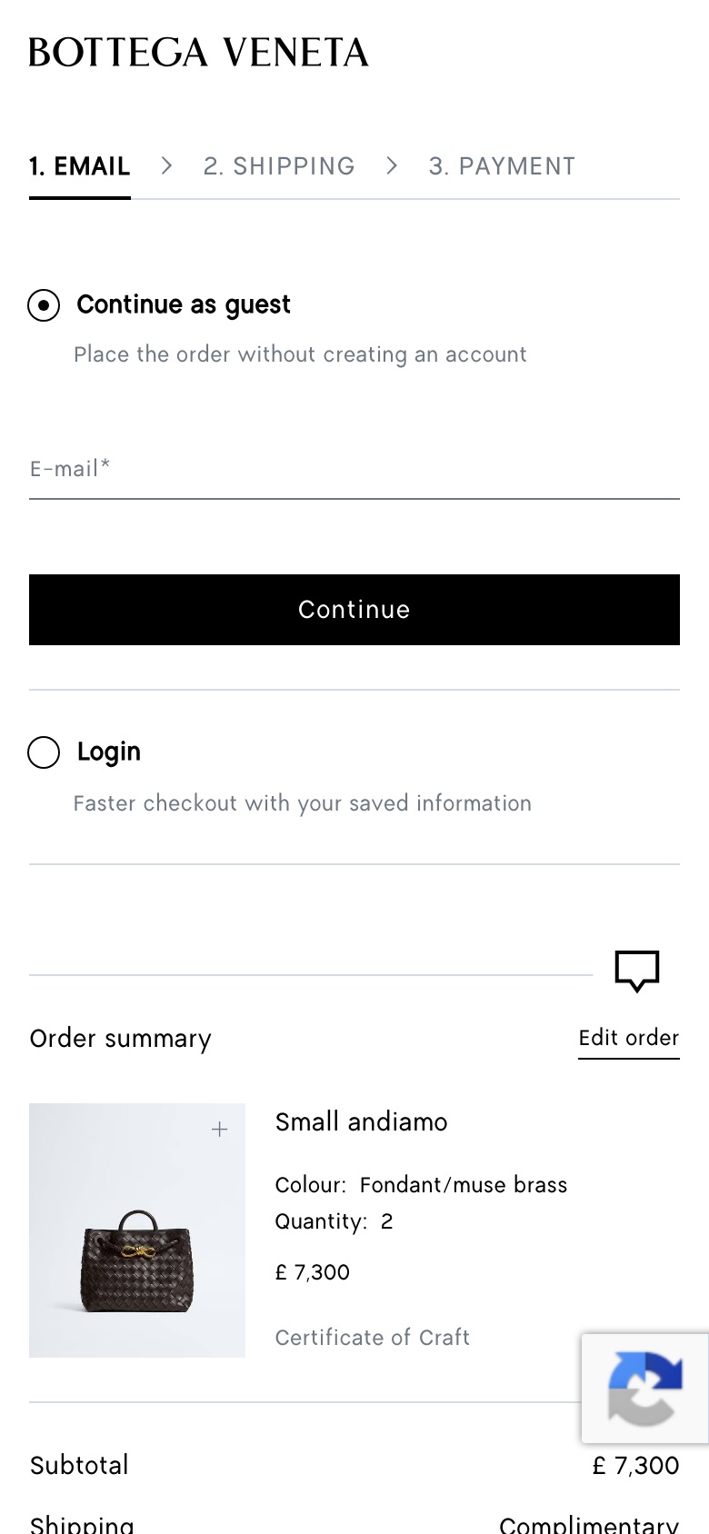
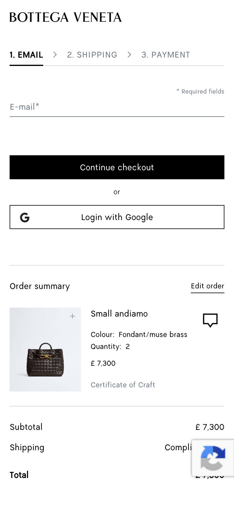
Replaces the plain e-mail form with a 'Continue as guest' option holding the e-mail field and a 'Continue' button, plus a 'Login' option below it
Likely hypothesis
By making guest checkout an explicit, pre-selected option next to login, we can lift completion of the e-mail step, because shoppers without an account see a clear path that does not require registering.
Seen 3 Aug to 7 Sep 2026
Problem being solved and strategic takeaway
Problem being solved
Shoppers without an account may feel unsure whether they must register to continue
Strategic takeaway
Presenting an explicit low-commitment path beside account login can reduce abandonment by removing the perceived need to register.
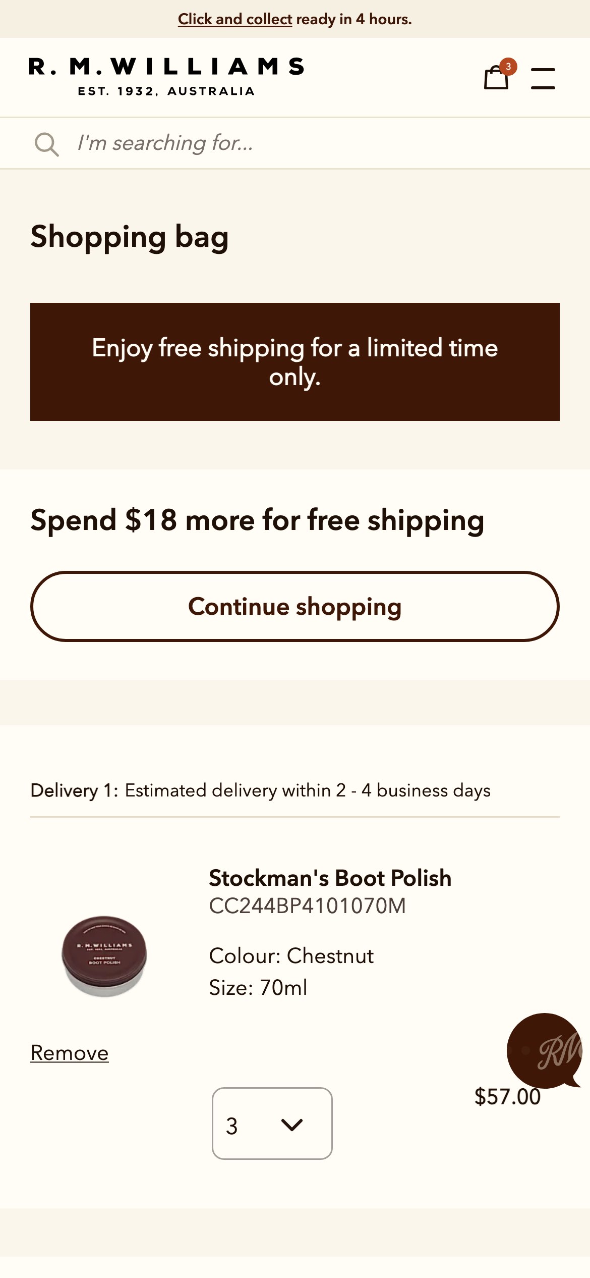
Adds a dynamic free-shipping progress tracker and contextual buttons to the cart.
Likely hypothesis
By displaying a real-time progress tracker for free shipping in the cart, we can increase average order value, because shoppers are motivated to add additional items to unlock the tangible reward.
Seen 16 May to 10 Aug 2026
Problem being solved and strategic takeaway
Problem being solved
Shoppers abandon carts or spend less because the free-shipping threshold is unclear.
Strategic takeaway
Visually tracking progress toward a tangible reward motivates users to increase their order size.
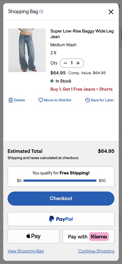
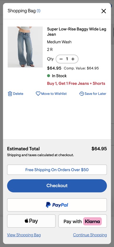
Adds a dynamic free shipping progress bar to the mini-cart.
Likely hypothesis
By adding a visual progress meter for free shipping to the mini-cart, we can increase average order value, because shoppers are motivated by gamified visual progress to add more items and reach the $50 threshold.
Seen 16 May to 13 Jul 2026
Problem being solved and strategic takeaway
Problem being solved
Shoppers have to manually calculate how far they are from earning free shipping.
Strategic takeaway
Visual progress trackers reduce cognitive load by automatically calculating remaining effort, motivating users to increase their spend to unlock a reward.
Principle
Goal Gradient Effect
Why real examples
Most A/B test examples online are hypothetical, or the same few case studies retold from list to list. A real example is evidence you can weigh. ABSee is experimentation intelligence for ecommerce: a record of real experiments run across 4,500+ brands, with the page before, the version tested, and whether it was kept. A good example is a real split (two versions of the same public page, served to ordinary visitors at the same time), dated, with the outcome in plain words: kept means the tested version became the page; rolled back means the original stayed. That is the brand’s decision, not a measured lift. The orange corners mark the change. For what brands are testing now, see the holiday checkout report and the fashion and beauty pulses.
How to use these
Start from your own problem
A drop-off at size selection points to the size examples, not the swatch ones.
Read both outcomes
A change one brand rolled back is as useful as one it kept.
Test it yourself
Another brand's decision is evidence for your hypothesis, not a result for your site. The record holds 25,000+ experiments; ask it inside Claude, ChatGPT or Gemini.
Questions
What is an example of an A/B test?
Reebok tested its product page without the 'Best For' section in the product details, against its original page. Both versions were served to ordinary visitors at the same time, seen from 7 August to 4 October 2026. Reebok kept the shorter page.
Where can I find real A/B test examples?
Most lists online reuse the same old case studies. ABSee keeps a record of 25,000+ real experiments run across 4,500+ ecommerce brands, with the page before, the version tested and whether it was kept.
Do these examples show which version won?
They show what the brand did next: whether the tested version became the page (kept) or the original stayed (rolled back). That is the brand's decision, not a measured lift. No outside tool sees a brand's own numbers.
Should I copy a test another brand kept?
Treat it as evidence for a hypothesis, not a result to copy. Your shoppers, traffic and prices differ.
 ZimmermannProduct page
 R.M.WilliamsProduct page
 CotopaxiProduct page
 Kate SpadeProduct page
 MonclerProduct page
 Kiehl'sProduct page
 New BalanceProduct page
 BalenciagaProduct page
 TimberlandHomepage
 QuayCart
 AéropostaleMini-cart